onsdag 30 oktober 2013

16. Inside or outside the box/ panel?


page 36 inked.
In creativity you often talk about to think inside or outside the box. When doing a comic you have to deal with boxes or panel all the time.

Each panel takes the story forward. When working on this graphic novel I try more and more to losen up that panelbox. You need to see it´s a box to understand where the story goes but you can give visual meaning to panel by removing some of the "walls". Somehow it´s can seen that the characters or whatever is inside the box/panel want to get out.
I also sets the mood of the story by removing the "walls".

When adding the second color I can work with this even more.

torsdag 24 oktober 2013

15. A bad drawing for a good story?

Page 32 almost inked.
This is a scan of a half page 32 in progress. Most of the inking are done. But still some more to add. And then the bluegreen color.
In one way I am a perfectionist but in this case I try not to be. I want the images not be too finished. They should have something left for the reader to complete.
I also defends on how you want the reader to read the image. How much will this panel tell. Is it important information about the story or is it the speed of something that you don´ t really understand.

And somehow could a "bad"drawing work better for the story than a "good" drawing. I don´t know how I succeed in it but I really like to work with these small variations.
In the half page here beside an old lady is appearing while Hasse and his friend starts to fight.

torsdag 17 oktober 2013

14. Inside or Outside

"This is the revenge. we shall give her the fear!" he says.
"Which revenge?"Hasse answer.
I have been working on this projects for many years. Or rather I have planned to do it for many years. There was a problem to get "inside" the project because of not being able to spend so many hours  needed.
To get inside a story you often need some time to do the  transfer. Of course You could tell yourself to start doing the work even if you just had an hour to work  on it.
But to get inside and "feel" the characters you need to be there within the story.

But when you work you sometimes need to get outside of the story. To try to see it from a reader perspective. Forgetting you are the one who did this. Trying to behave like you never seen this comic before. To read it for the first time.


fredag 11 oktober 2013

13. Road of reading

Page 37, sketch before inking.
When you work with film you work with images and the time. When you write a story you work word by word.
There are different ways of reading in all arts.

In comics you have the row of panels but also the lines of movement in the images. Well, it depends of course how you work but in this story I have decided to use a "fast flow" storytelling.

Here beside are the sketch of page 37 ( a right page ). ( This is how it looks like before I let my brush go to attack. ) I have drawn the "road of reading" with a red line,
The scene is like this.
First row:These guys have fooled an old lady and stolen her hat.
Second row: They get very happy about this. first two panels of laughing,. The third panel "the hat in the air" and the in the last panel, Hasse says "She thought I was dead."
The third row are only one panel. The plan is that you read all the text bubbles first, then see the car coming in, follow the road   back to the left and then you come back to the bridge ( where it all takes place ) and out of the page to turn to page 38.

That was my plan. I will show you when this page is inked.

Today I have a reading recommendation.
It´s called "Daybreak" by Brian Ralph. It´s published in 2011 by Drawn & Quarterly. It´s a zombie comic. I am mostly not so fund of zombie -stories but the interesting thing about this story is that the "I" in the story are the reading. So you never see that person, besides some hand now and then. Very nice storytelling and artwork.

tisdag 8 oktober 2013

12. The Speed

In the comic You have to deal with the SPEED.

The Speed if something is moving. Is it a fast move?  Like the one on the image where Hasse remove the boots from his mothers foot.

Is it a slow move? Maybe you might think that the move is not important but even a small move can tell the story.

You have to deal with the Speed of reading as well. Do you want the reading to move smoth or maybe be like a labyrinth?
If it´s action you often want to have a higher speed of reading than if it a more sensitive scene.

fredag 4 oktober 2013

11. The Balance

"Are you stupid?"   -   "No!"
Another tricky thing is to find the balance.

The Balance between the image in each panel and the whole spread of two pages. Mostly it´s a matter of how detailed the work should be.

The Balance between one page and the whole story of 150 pages.
I have sketched out the 150 pages roughly but that is mostly to make sure the story is right planned. To get an idea how long it should be.

The single panel might look good when you only look at it but when you see it together with the other panels it might not work at all.
You need the right balance to get the right flow in the story that you want.


torsdag 3 oktober 2013

10. Changing perspective

Is the cat or the boy the murderer?
The Maincharacter in this story is called Hasse. I guess that is a very Swedish name. In the title of the story it says that Hasse is a murderer.

In the image beside you see Hasse. But is it the boy or the cat? What do you think? The stories would be very different from each other.

In this case the story is already finished so I will not rewrite it. But changing perspective is a very good way of discover new things.
In writing a story the method is obvious but even if you are inking an image and have to decide what should be black or what should stay white you use "the other way" thinkin. The other way often gives you a surprise. sometimes you can use and sometimes not. But it opens a door to new ideas.

I use that "change perspective" often to find new ways. Anyone else who use that or have any other method?

onsdag 2 oktober 2013

9.The Voice

"I"..."I was wrong"...."I told"..."you!"
Sound could maybe be the most difficult thing in comics. Not big sounds like explosions which you can transform into action in movement and sounds symbols.

But the voice of a character  are more difficult. I first had a plan to use different fonts to show how different people speak but at the moment I have changed my mind.

My plan now is to use same font. I made the font myself  based on my own handwriting. It still need to be fixed and made into a bold version but I think it will work.
You can use several things to set the voice of the character. You can have much space in the speakingbubble. You can put the bubble on different places. You can have an invisible bubble. In the image here the boy Hasse have problems to answer in a straight way.
You can use many different ways but still it has to be readable.

tisdag 1 oktober 2013

8. visual language

When the black outlines goes greenblue it´s a dreamworld.
When you work on a comic you have different levels of visual storytelling to deal with. One way is the style of the artwork. Often the artwork of the comic looks the same through the story. If it´s changing to much you might feel like it doesn´t belonged to each other. But you can work with small and bigger differences.

In my story I have one sketchy style in the beginning of the story because there is a short intro where someone remember something and then the story starts. Within the mainstory I have 3 different styles. That´s what I planning now. If they do not work I will have to change that.

First you have the mainstyle which you see on last days post. That´s the "now" in the story. The second style is when someone is dreaming and the third is when something is telling about something.

måndag 30 september 2013

7. Three colours

And this id how the original image became.

I had decided to use black and one other colour. I am not sure of the exact colour but at the moment it is this bluegreen color.
So I have black, bluegreen and white to work with.

I like to set up limits and work within that. The work get more creative in a way.

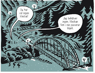
In this panel I have an open bubble. I tries as much as possible to open up the panels, not get them boxed in all the time. You should feel the limits of the panel but not always need to use all 4 four lines.

The story use three other kind of styles, depending on the how it´s told. I will explain more about that tomorrow.

söndag 29 september 2013

6. The Line

A  comic has the storyline and the words that are told and spoken. But most it has images that are the base of a comic. In a textstory the pages look almost the same. You can have a different font and size and decide if you want to use more space between the words.

But with a graphic story the images sets the feeling of the story. And that can be done in so many ways. It starts from the way the character look to how you plan the panels. Yet it has to be readable. But you choose if you want to have a fast reading or if you want to slow it down. 

I have choosen to tell my mainstory with a thick and rough line. I use a brush and black ink. I really like to work the brush where you in one stroke can go from a thick to a thin line. But I can´t controll it 100 % so somtimes it goes the wrong way. But that´s also something i like. Sometimes things happens that I did not plan but I prefer to instead of undo ( I don´t do this digital ) I tries to make it work.  All these "mistakes" makes the image more alive I think.

lördag 28 september 2013

5. Where it all happens

Panel. In Swedish language
This story is happening in the north of Sweden. It´s winter. It´s cold, snowy and dark.

The idea is more that you shall feel the enviroment rather than understand it. I don´t draw so much details it´s more  roughed out so you understand if you are inside or outside.
By not being to detailed I hope the reader will create their own surroundings in their minds. Often used in theatre.

The most important place in this story is the bridge.  We will get back to this manys times in this blogg I think.

fredag 27 september 2013

4. The Characters

The Dad
This story has three maincharacters.
Then there are four more which has a bigger role to play. When designing a character you can keep on for many hours to find a good design, but somehow it´s not until you set him/her in action that you really get to know the character. It´s the same with all storytelling ( I think ).

When you are in the "real" story and situation you get to know that character and learn how  he/she should behave. It´s not so much about the shape of the nose it´s more to understand the personality.

Characters is what I like most to work with. To dive into the soul of a character and to find out who he or she is.

torsdag 26 september 2013

3. Words

I also write stories of my own for other project ( animation, comics, books ) but now the words where all there from the start.

First I had to do a very rough plan for the story to see how long it could be. I was aiming for not more than 150 pages.

And when you start to study the script closely and get involved in the characters these words become their voices. And through these words you get to know all the characters. The story has a character who never speaks but he is around.

And you also realize that sometimes you need to have pause ( silent panels ) between the dialogue. And you also have to find out why they say these words and what they are doing. And if the power of the words works best with a close upp image or if you can use an extrem overview.

I wanted every word to be important. If not I could remove it.

onsdag 25 september 2013

2. The Play

Rough sketch from the comic.
The Play by Henning Mankell was written over 20 years ago. Since I read it in a theatermagazine it has been in my mind. There was something there I wanted to take a closer look at.

It was much work to adapt the play to a graphic script. Much dialouge has to be removed but I never added any new dialogue. ( Well, maybe a few words in the end. )  I just did choose what to keep.

The dialogue in the comic needed to be limited to be able to make a good flow. And some words were made into action.

tisdag 24 september 2013

1.The Start

Today I start this blog about my work on a graphic novel. It´s a project that has been with me for many years but Ihave had problems in getting the time to finish it. Now is the time to do it.
The graphic novel is based on a play by Henning Mankell. The english title of the play is "Bridge to the Stars".  The Swedish title is "Sanningen om den Samvetslöse mördaren Hasse Karlsson".

The comic is planned to be about 150 pages and to be finished in summer 2014.
In this blog I will show you how I work and what happens with the book. If it finds a publisher etc.
I will do my best to upload content almost every day.

I hope you want to follow me on this journey.

/ Mattias Gordon